Skip to content

Key Takeaway Table: 5 Steps to Perfect Color Matching
| Step | What to Do | Why It Matters |
|---|---|---|
| Pick Color Profile | Use CMYK for printing | Matches printer abilities |
| Check Proofs | Review printed sample | Catches errors early |
| Talk to Printer | Share color goals | Aligns everyone |
| Use Calibration | Adjust screens and printers | Keeps colors accurate |
| Test Small Batches | Print few copies to adjust | Prevents big mistakes |
Imagine you order a stack of books, excited to see your design in print, but the colors look totally off. Bright blues turn gray, and vivid reds fade to pink—disaster! Did you know that 80% of people decide if they like a book just by its looks? That’s why color matching in book printing is so important. Whether you’re creating a colorful kids’ storybook or a sharp novel cover, getting the colors right makes your book stand out. In this huge guide, I’ll walk you through every step to achieve perfect color matching. Plus, I’ll share some insider tips from Huaxin Printing, a company that knows printing like the back of their hand, to help you get amazing results every time.
Understanding Color Profiles for Book Printing
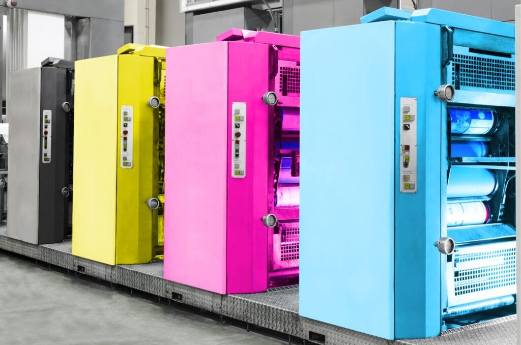
Let’s start with the basics: color profiles. These are like instructions that tell your printer how to show colors on paper. Without them, your book might look like a muddy mess instead of a masterpiece. There are two big types you need to understand: RGB and CMYK. RGB stands for red, green, blue, and it’s what your computer screen uses. It’s super bright and fun, but it’s not great for printing. CMYK, which means cyan, magenta, yellow, black, is the one printers love. It mixes ink to make colors on paper, so it’s what you need to use.
Why does this matter so much? If you send your printer an RGB file without changing it to CMYK, the colors can come out all wrong. That bright purple you loved on your screen might turn into a dull blob on the page. To avoid this, always switch to CMYK before you send your design. It’s a simple step, but it makes a huge difference in how your book turns out.

Now, picking the right color profile isn’t the same for every book. If you’re printing something with tons of pictures, like an art book, you need a profile that can handle lots of different colors. But if it’s a plain novel with mostly text, a simpler profile works just fine. At Huaxin Printing, they’re experts at figuring this out. They’ve been helping people print books for years, so they can look at your project and say, “Hey, this profile will work best with your paper and ink.” It’s like having a friend who knows all the secrets to great printing.
Mistakes to Watch Out For:
- Forgetting to change RGB to CMYK before printing.
- Using a profile that doesn’t match your book type.
- Not asking your printer what they can handle.
One time, I heard about someone who sent an RGB file to their printer without checking. The result was a book where the bright oranges turned into a weird brown. Yuck! To avoid that, double-check your file and talk to your printer. Another tip is to look at your screen settings. Sometimes your monitor shows colors differently than they’ll print, so adjusting it can help. We’ll talk more about that later when we get to tools.
Mastering the Proofing Process
Next, let’s talk about proofing. Proofs are like a test version of your book before you print a whole bunch. They’re super important because they let you see what’s coming before it’s too late to fix. Imagine spending money on thousands of copies, only to find the colors are off—that’s a nightmare! Proofs save you from that by giving you a chance to spot problems early.
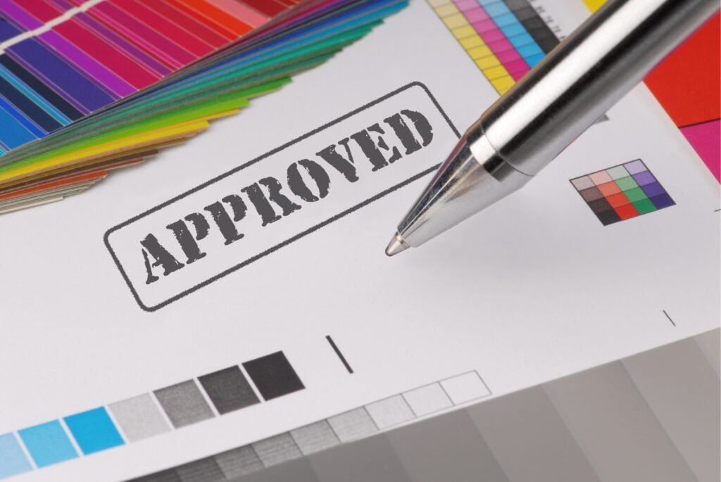
There are two kinds of proofs you’ll run into: digital and physical. Digital proofs show up on your computer screen. They’re fast and easy, so you can get a quick peek at your design. But here’s the catch—screens don’t always show colors the same way paper does. That’s why physical proofs are better. A physical proof is an actual printed sample you can hold in your hands. It shows you exactly how the ink looks on the page, which is way more accurate.
At Huaxin Printing, they’re champs at both kinds of proofs, but they really shine with physical ones. They know how much you care about your book, so they take the time to print a sample that matches your vision. When I talked to them once, they said, “We don’t just print—we make sure it’s right.” That kind of care builds trust, and it’s why so many people choose them for their projects.
How to Check Your Proof Like a Pro:
- Hold it under bright light, not a dim bulb.
- Compare it to your original design—are the colors close?
- Look for funky lines or smudges that shouldn’t be there.
- Ask yourself, “Does this feel like my book?”
Checking a proof is easy and kind of fun. Grab it, sit somewhere bright, and really look at it. Does that green match the forest you pictured? Is the red as bold as you wanted? If something’s off, tell your printer right away. They can tweak it before the big run starts. Taking a few minutes here can save you from a big mess later, and it’s exciting to see your book coming together.
Collaborating with Your Printer for Color Success
Your printer isn’t just some stranger running a machine—they’re your partner in this adventure. Working together is the key to getting colors that pop. First, you need to tell them exactly what you want. Don’t just say, “I want it colorful.” Be specific! Say something like, “I need a deep blue like the ocean for my cover.” Even better, show them a picture or give them a color code, like a Pantone number. That way, they know exactly what you’re aiming for.
Printers also have a ton of experience you can use. At Huaxin Printing, they’ve worked on all kinds of books—kids’ stories, cookbooks, you name it. They can tell you if your bright pink will look good on glossy paper or if it’ll fade on matte. So, don’t be shy—ask them questions! Here’s what you might say:
- “What inks do you use for bright colors?”
- “Can your machine handle this shade?”
- “Any tips for making my design pop?”
Their answers can make your book even better. For example, they might suggest a slightly different blue that their printer loves. Listening to them can turn a good idea into a great one.

Then there’s testing. Before you print a million copies, do a small run. Print a handful of books, look at the colors, and see if they’re right. Maybe the purple’s too dark—lighten it up. Or the yellow’s too faint—pump it up. This back-and-forth with your printer is gold. Huaxin Printing is awesome at this—they’ll test with you until every page looks perfect. It’s like having a teammate who’s as picky about colors as you are!
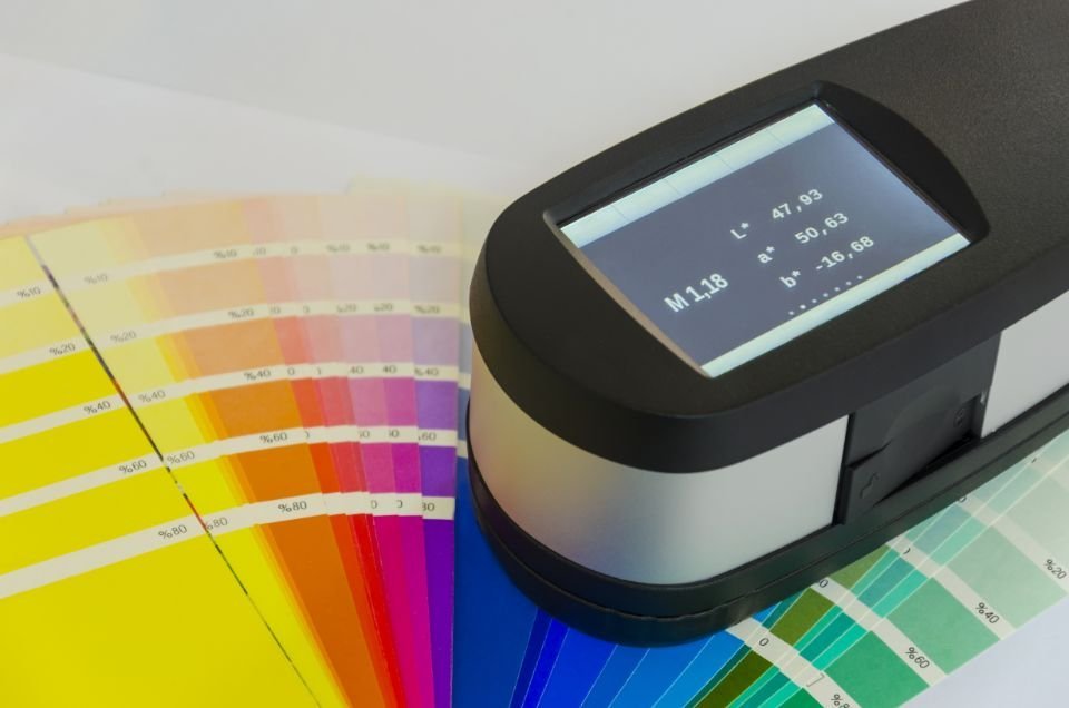
Tools and Techniques for Consistent Color Matching
Now, let’s get into the cool stuff—tools and tricks! These help you keep colors spot-on from start to finish. First, there are calibration tools. These are gadgets or programs that fix your screen and printer so they show colors the same way. Check out these options:
- X-Rite: A little device that tunes your monitor.
- Spyder: Software that matches screen to print.
Why bother? Because your screen might show a bright teal, but the printer makes it dull. Calibration fixes that gap so what you see is what you get. It’s a small step that makes a big difference.
Another superstar is the Pantone Matching System, or PMS. It’s like a giant color menu. You flip through swatches, pick one—like “PANTONE 347 C” for a lush green—and your printer uses that code to match it perfectly. It’s great for making sure every book looks the same, no matter how many you print. Huaxin Printing uses Pantone all the time. They told me, “It’s our secret weapon for consistency.” And it works—their books always look sharp.
Tips for Keeping Colors Steady:
- Stick to one ink type—don’t switch halfway.
- Check the printer during the run—machines can wander.
- Print samples now and then—catch changes fast.
Big print runs can be tricky. Imagine printing 10,000 books, and the blue starts looking purple halfway through. To stop that, keep everything the same—ink, settings, all of it. Sampling during the run helps, too. Pull a few copies every so often and check them. If something’s off, fix it quick. These little habits keep your colors rocking from the first book to the last.
Why Color Matching Matters More Than You Think
Let’s zoom out for a second—why care so much about colors? Because they’re not just pretty—they tell your story. A blazing orange in a comic book yells excitement. A gentle lavender in a romance novel whispers love. If those colors go wrong, your book feels off. Readers might not say, “The hue’s bad,” but they’ll feel it. Good colors grab their attention and keep them hooked.
For anyone making books—authors, businesses, whoever—this is huge. A book with perfect colors stands out in a store. It says, “I’m worth picking up!” It also shows you’re serious about quality, which builds trust. Huaxin Printing gets this big time. They’ve made a name for themselves by delivering books where every shade is spot-on. Their focus on color accuracy turns your project into something special, not just another print job.
Think about a real case: a publisher wanted a kids’ book with a sunny yellow sun. They worked with their printer, used Pantone, and checked proofs. The result was a book that glowed on the shelf—kids couldn’t resist it. That’s the power of getting colors right!
How to Jump Into Color Matching Today
Ready to start? Here’s your game plan:
- Dream up your book’s colors—what do you see?
- Go with CMYK—it’s the printer’s best friend. (What’s the difference between CMYK and RGB?)
- Find a printer who talks back—communication rocks.
- Get a proof—look at it hard.
- Test a few copies—make them perfect.
It’s simple, but it works every time. If you’re not sure where to begin, reach out to Huaxin Printing. They’ve got the skills and gear to make your colors sing. Whether you’re printing five books or 5,000, they’ll guide you step-by-step. You don’t have to figure it out alone—let the pros help you shine!
What if you’re on a budget? Start small. Pick one color that matters most—like a bold red for your title—and focus on nailing that. Test it, tweak it, and build from there. Even little wins add up to a great book.
Stories of Color Matching Success
Let’s look at some real wins to inspire you. First, a kids’ book about dinosaurs. The designer wanted a fierce red for the T-Rex and a deep green for the jungle. They switched to CMYK, grabbed a physical proof, and worked with their printer to tweak the red until it roared. The book flew off shelves—kids loved the bold colors!
Then there’s a photography book with stunning landscapes. The author picked Pantone shades for the skies—crisp blue and warm gold. They calibrated their screen, tested a batch, and got colors that looked alive. Reviewers said, “It’s like stepping into the picture!” These stories show how the steps we’ve covered turn dreams into reality.
Another quick one: a cookbook author wanted a rich chocolate brown for dessert pics. They used PMS, checked proofs under different lights, and nailed it. Readers said the photos made them hungry just looking at them. That’s what perfect color matching can do!
Avoiding Color Matching Slip-Ups
Even with a solid plan, things can go sideways. Here’s what to watch for:
- Crazy Colors: Neon green might not print—ask first.
- No Proofs: Skipping this risks a big flop—always check!
- Lighting Tricks: Colors shift in dim light—test in sun, too.
I heard about a guy who rushed his print job and skipped proofs. His bright teal cover turned swampy green—total bummer. Don’t be that guy! Take your time and check everything. Huaxin Printing catches these mistakes before they happen. They’ll nudge you to proof or tweak a color if it won’t work. It’s like having a safety net for your book.
Wrapping It All Up
So, there you have it—your ultimate guide to perfect color matching in book printing! Start with profiles, master proofs, team up with your printer, and use cool tools. Every step builds a book that looks amazing—colors that pop and pull readers in. Don’t wait—grab your design, contact Huaxin Printing for a quote, and get those hues flowing. Want more secrets? Sign up for their newsletter and get pro tips straight to your inbox. Your next book’s going to be a color masterpiece—let’s make it happen!
FAQs About Color Matching in Book Printing
What’s the best color profile for book printing?
CMYK is the winner—it’s what printers use, so colors stay true on paper.
How do I know my proof is good?
Look at it in bright light and match it to your design. No weird stuff? You’re good!
Why do screen and print colors look different?
Screens use RGB, which is bold; printers use CMYK, which is softer. Calibration helps.
Can Huaxin Printing make my colors perfect?
Yes! They’re pros at proofs and matching—they’ll get your vision just right.