Skip to content

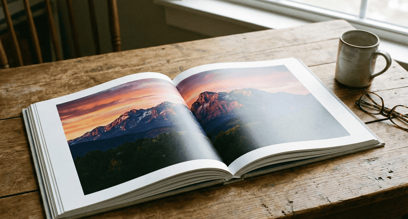
Your delicious recipes look dull and unappetizing in print. This can ruin your cookbook’s appeal before anyone tries a recipe. Getting the technical details right ensures your photos look amazing.
To print a cookbook with clear, high-quality photos, you must use high-resolution images (300 DPI), choose a coated paper that makes colors pop, and work with a printer who uses a strict color management system. This combination ensures every image is sharp, vibrant, and accurate.

For over 37 years, my family’s business has lived and breathed printing. I’ve seen countless cookbook projects come to life, and the most successful ones always get a few key things right. It is not just about having great recipes; it is about presenting them in a way that makes mouths water. Let us break down exactly how you can achieve that professional, high-quality look for your own cookbook.
How to make a photo high quality for printing?
A great photo on your screen looks blurry and pixelated when printed. This can make your entire cookbook feel unprofessional, undermining the quality of your hard work. The solution is simple: prepare your files correctly.
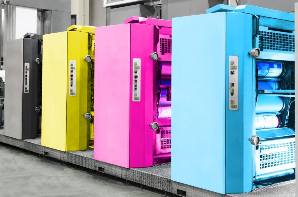
To ensure your photos are high quality for printing, they must have a resolution of 300 DPI (dots per inch) at the size they will be printed. Always save them in CMYK color mode, not RGB, and use a high-quality file format like TIFF or JPEG.
Getting your photos ready for print involves a few technical steps that make all the difference. Think of it as prepping your ingredients before you start cooking. First is resolution. Your screen shows images at 72 PPI (pixels per inch), but for sharp print, you need 300 DPI1 (dots per inch). Next is the color mode. Your camera and computer screen use RGB (Red, Green, Blue) light to display images. Printers, however, use CMYK2 (Cyan, Magenta, Yellow, Black) ink. Converting your images to CMYK beforehand gives you more control over the final colors. Finally, the file format matters. While JPEGs are common, a TIFF3 file is often better because it does not lose quality each time you save it.
| Setting | Recommendation for Print | Why It Matters |
|---|---|---|
| Resolution | 300 DPI | Ensures the image is sharp and not pixelated. |
| Color Mode | CMYK | Matches the ink process used in printing for accurate colors. |
| File Format | TIFF or High-Quality JPEG | TIFF is lossless; JPEG is smaller but can lose quality. |
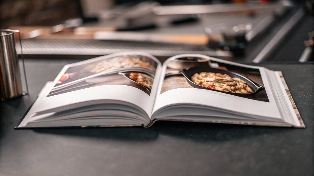
What is the best paper to print a cookbook on?
You picked a paper, but now your vibrant photos look faded and dull. The wrong paper can also absorb grease from fingerprints in the kitchen, quickly making your cookbook look worn.
The best paper for a cookbook is typically a coated stock, either gloss or silk/matte. Coated paper prevents ink from soaking in, keeping photos sharp and colors vibrant. A paper weight of 128gsm to 157gsm offers a quality feel without being too stiff.

The paper you choose is the foundation of your cookbook’s look and feel. There are two main categories: coated and uncoated. Uncoated paper is porous, like standard office paper, and can make images look softer and less vibrant. For cookbooks, you almost always want coated paper. The coating acts as a seal, so the ink sits on top. This results in sharper details and brighter colors, which is essential for food photography. Within coated papers, you have two popular finishes. Gloss finish gives you the most vibrant colors and a shiny look, but it can create glare. Silk or matte finish has less glare and provides a more modern, sophisticated feel while still keeping colors bright. I personally love a silk finish for cookbooks; it feels premium and is easy on the eyes under kitchen lights.
How to make sure that the colors of the cookbooks are accurately reflected?
You approved a design on screen, but the printed book arrives with colors that look wrong. That perfect red strawberry now looks brownish, which can make your recipes seem unappealing and untrustworthy.
To guarantee accurate colors, your files must be in CMYK. More importantly, you need to partner with a printer that has a robust color management system. Ask if they provide a calibrated digital proof or a physical press proof for you to approve before the full run.
This is where my experience really comes into play. Consistent color is not magic; it is science. A professional printer achieves it through strict color management1. It starts with using a specific "color profile2," like GRACoL or FOGRA, which is a set of data that standardizes how colors appear on a specific paper type with specific inks. When we receive your files, we apply the correct profile to ensure what you see on a calibrated proof is what you will get on the press. At my company, we use a system called PressSign3. It is essentially a scoring system that measures the printed sheets against the international color standard. It gives us a number score for accuracy, removing all guesswork. This ensures the first copy and the last copy of your cookbook look exactly the same.
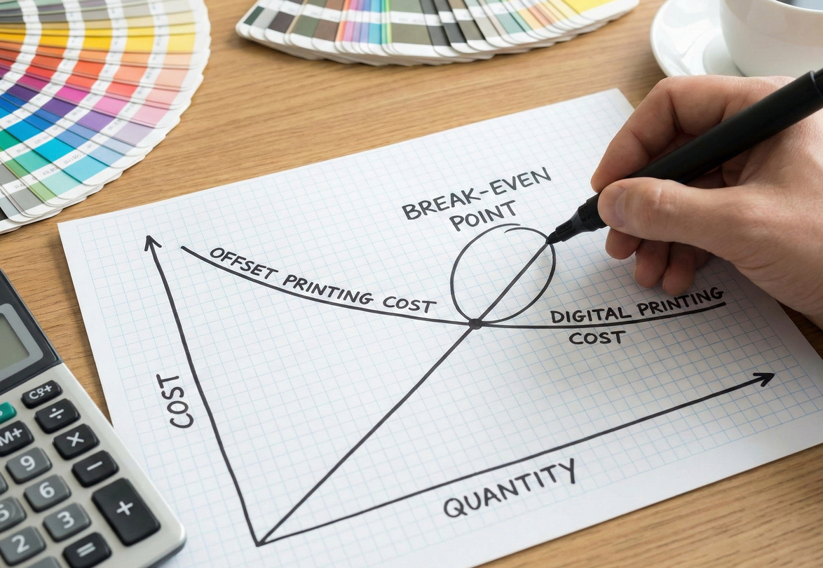
What is the best printing method for books?
You are ready to print your cookbook but are confused by the different printing options. Choosing the wrong one can mean spending too much money or ending up with a low-quality product that fails to impress.
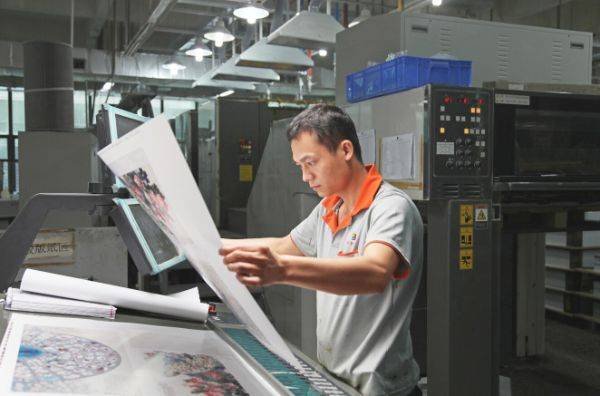
For print runs of 500 copies or more, offset printing is the best method. It offers the highest quality and the lowest per-unit cost at scale. For smaller quantities or projects requiring personalization, digital printing is a better and more flexible choice.
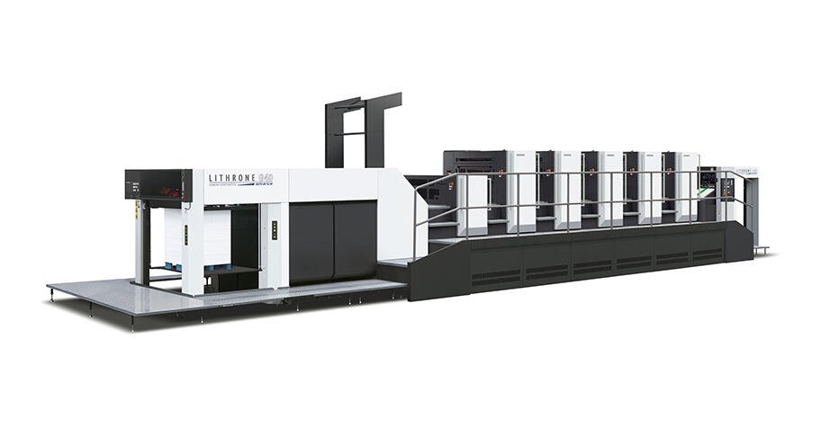
The choice between offset and digital printing1 comes down to quantity and quality. Offset printing uses metal plates to transfer ink onto paper. The setup cost is high, but once it is running, the cost per book becomes very low. This method produces incredibly sharp text and rich, consistent colors, making it the gold standard for high-end projects like cookbooks. Digital printing, on the other hand, works more like a high-end office printer, applying toner or ink directly to the paper. It has almost no setup cost, so it is perfect for small runs (under 500 copies). While modern digital quality is very good, I find that offset printing2 still has the edge for the nuanced and vibrant colors you want in food photography.
| Feature | Offset Printing | Digital Printing |
|---|---|---|
| Best for | 500+ copies | Under 500 copies |
| Quality | Highest, very consistent | Very good, can have minor variations |
| Cost | Low per-unit cost at high volume | Low setup cost, higher per-unit cost |
| Turnaround | Longer (due to setup) | Faster |
How to choose the most suitable supplier to print cookbooks?
You are prepared to print, but you are not sure who to trust with your project. A bad supplier can cause major headaches with poor quality, missed deadlines, and unexpected costs, putting your entire launch at risk.
Choose a supplier who specializes in high-quality book printing, not a general commercial printer. Ask for physical samples of their cookbooks, verify their color management process, and ensure they offer clear and responsive communication throughout the project.
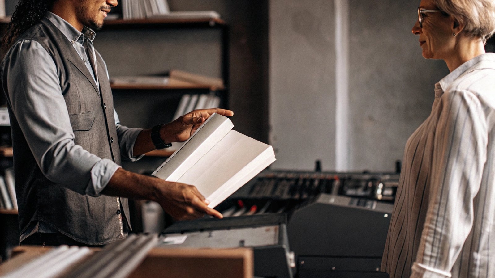
Finding the right printing partner is the most critical decision you will make. First, look for a specialist. A printer that produces books every day understands the nuances of binding, paper grain, and cover finishes in a way a general printer does not. Always ask for samples of similar projects they have printed. Do not just look at photos online; get a physical copy in your hands to feel the paper and see the print quality up close. Ask them directly about their quality control. A great question is, "What system do you use for color management?" If they mention things like PressSign or G7 certification[1], you know they are serious about accuracy. As someone who works with clients like Stephanie from the US, I know clear communication is key. Your supplier should feel like a partner who is invested in your success.
Conclusion
Printing a beautiful cookbook comes down to mastering your photos, paper, and color. By focusing on these technical details and choosing an expert partner, your cookbook will look professional and delicious.
-
Learn about digital printing’s cost-effectiveness and quality to see if it suits your printing needs, especially for smaller projects. ↩ ↩ ↩
-
Explore the benefits of offset printing, especially for high-quality projects, to understand why it’s preferred for professional printing needs. ↩ ↩ ↩
-
Discover how PressSign enhances print accuracy and consistency, ensuring high-quality results for your projects. ↩ ↩