")
Tired of strange patterns appearing on your printed art? This moiré effect can ruin a beautiful catalog. I’ll show you the printing secret to avoid it completely.
Museum-grade catalogs prefer FM (or stochastic) screening because it uses random dots to print images. This completely eliminates moiré, those ugly patterns that can appear on detailed artwork. It creates sharper, more photorealistic reproductions that honor the original art, which AM screening can’t always guarantee.
You might wonder what this "FM screening" is and how it really works. Over my 38 years in printing, I’ve seen it transform art reproduction. Let’s break down why it’s the gold standard for quality. Understanding this can save you from a disappointing print run.
What is FM Printing?
Heard the term "FM screening" but not sure what it means? It sounds complex, but the idea is simple. Let me explain it in a way anyone can understand.
FM printing, also called stochastic screening, prints images using tiny dots of the same size. But, it places them randomly, closer together for dark areas and further apart for light areas. This method avoids the fixed grid pattern seen in traditional printing, resulting in incredible detail.
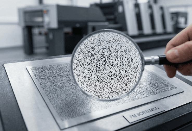
Think of a traditional printed image as a neat grid. FM printing throws that grid away. The "FM" stands for Frequency Modulated. The size of the dot doesn’t change, but how often it appears (its frequency) does. In dark parts of an image, the printer lays down a lot of these tiny, 20-micron dots. In light areas, it uses very few. Because their placement is what I call "organized chaos"—it’s a pseudo-random pattern—your eye blends them together perfectly. You don’t see dots; you see a continuous, smooth tone, much like a photograph. This is why it’s a game-changer. We’re not trying to trick the eye with a pattern. We’re recreating the image with a level of detail that was previously impossible in offset printing. It’s about achieving pure, uncompromised image fidelity for every single page.
What is the Difference Between FM Printing and AM Printing?
You now know about FM printing, but how does it compare to the standard, AM printing? The difference is critical. It can make or break a high-end catalog.
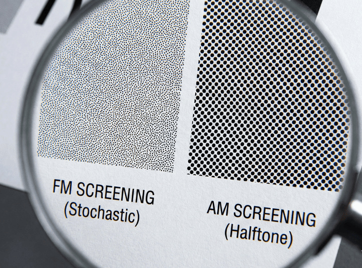
The key difference is how they create tones1. AM (Amplitude Modulated) printing2 uses a fixed grid. It changes the size of the dots—bigger dots for dark areas, smaller for light. FM (Frequency Modulated) printing uses same-sized dots but changes their spacing to create tones1.
I’ve spent my life looking at printed sheets. The difference between AM and FM is obvious once you know what to look for. AM screening is the industry workhorse. It arranges dots in a very precise grid, what we call lines per inch (LPI). For a high-quality job, that’s maybe 175 or 200 LPI. But under a magnifying glass, you can see the "rosette" pattern where the color dots overlap. This pattern can cause problems, especially moiré. FM screening, with its 20-micron dots, acts like a 350 or even 400 LPI screen. The rosette pattern is gone. The detail is stunning.
| Feature | AM (Amplitude Modulated) Screening | FM (Stochastic) Screening |
|---|---|---|
| Dot Method | Dots vary in size. | Dots are uniform in size. |
| Dot Placement | Placed on a fixed grid. | Placed randomly (stochastically). |
| Tone Creation | By changing dot size. | By changing dot frequency/spacing. |
| Common Issue | Moiré patterns, visible rosettes. | Requires stricter press control. |
| Best For | General commercial printing. | High-fidelity art reproduction. |
This table clearly shows the trade-offs. For a museum catalog, where every brushstroke matters and patterns in the art itself are common, FM is often the only choice for true representation.
Why Are Printed Catalogs Still Important in the Digital Age?
With everything online, is it a waste to print a catalog? People think print is outdated. But for a museum or gallery, a physical catalog has a power digital can’t match.
A printed catalog is a tangible, lasting object that reflects the quality and permanence of the art itself. It offers a focused, curated experience without digital distractions. It becomes a collectible keepsake, reinforcing the institution’s brand and providing a high-quality reference long after an exhibition closes.

I was talking with Christine, a Print Production Director I’ve worked with for years. She has over two decades of experience in publishing. She put it perfectly: "A screen is temporary, but a book is a permanent record." A museum catalog isn’t just a list of works. It’s an extension of the exhibition. Holding it in your hands is a sensory experience—the weight of the paper, the smell of the ink, the texture of the cover. It creates a connection. People don’t just glance at a beautiful catalog; they spend time with it. They put it on their coffee table. It’s a statement piece that says, "This art is important." In a world of endless scrolling and pop-up ads, the focused, quiet experience of a printed catalog is more valuable, not less. It cements the museum’s reputation for quality and scholarship.
What Does Museum Catalog Printing Need to Achieve in terms of Quality?
Everyone wants "high quality" printing. But what does that actually mean for a museum catalog? Without clear standards, you risk getting a product that just isn’t good enough.
Museum-quality printing must achieve three things: absolute color fidelity to match the original art, perfect image sharpness to show every detail without distortion or moiré, and consistency across the entire print run. Every single copy must be an exact match of the approved proof.

When a museum trusts us with their catalog, they are trusting us with their reputation. The quality has to be perfect.
First is Color Fidelity. The printed red must be the artist’s red. This requires precise color management from screen to press.
Second is Image Detail and Sharpness. This is where FM screening is non-negotiable. We need to reproduce the texture of canvas, the fine lines of an etching, or the subtle weave of a textile. AM screening can create moiré on these patterns, which is an automatic failure. FM screening’s random dots eliminate this risk completely.
Third is Consistency. The first book off the press must look exactly like the five-thousandth. This demands incredible process control—stable platemaking, consistent ink density, and a team that understands the stakes. It’s not just about making a pretty picture; it’s about faithfully honoring the artist’s original vision, thousands of times over.
Is Digital Printing a Better Replacement for Museum Catalogs?
Digital printing is fast and cost-effective for small runs. It’s tempting to think it’s the modern solution for everything. But is it right for a high-stakes museum catalog?
Digital printing is a good option for very small print runs (under 500 copies) or tight budgets. While its quality is improving, it cannot yet match the detail, color depth, and consistency of high-end offset printing using FM screening. It’s a trade-off between cost and ultimate quality.
I get this question a lot. The technology for digital printing has come a long way, and for many projects, it’s a fantastic tool. If a gallery needs 200 catalogs for a small show and the budget is tight, digital printing is a smart choice. It avoids the high setup costs of offset printing. However, for a major museum exhibition, the standard is different. Current high-end digital presses are very good, but they still struggle to replicate the sheer resolution and tonal smoothness of FM offset printing. The way digital presses lay down toner or ink is fundamentally different. You might see subtle banding in smooth gradients or lose the finest details in shadows. When the goal is a perfect, archival reproduction of a masterpiece, offset with FM screening is still the champion. It’s about choosing the right tool for the job.
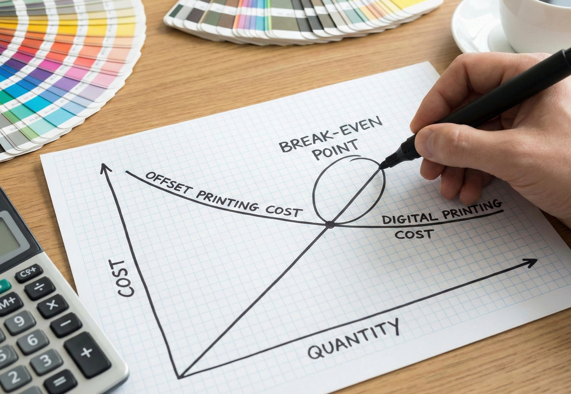
What if I Think FM Printing is Too Expensive?
The initial quote for FM screening can be higher than for standard AM printing. This might make you hesitate. But looking only at the price tag is a mistake.
Think of the higher cost of FM printing not as an expense, but as insurance. It protects your investment. It eliminates the risk of a rejected print run due to moiré or other quality issues, which would cost far more in time, money, and reputation.

The higher cost of FM printing isn’t really for the technology itself. It’s for the intense process control required to execute it perfectly. The plates have to be flawless. The press conditions—ink, water, pressure—must be incredibly stable. This demands more time, more skill, and better equipment. So yes, it costs more upfront. But what is the cost of getting it wrong? Imagine printing 5,000 catalogs and the artist or curator rejects them because a moiré pattern appeared on a key piece of art. The cost of reprinting, not to mention the damage to your relationship and reputation, is massive. The extra investment in FM screening is your guarantee against that kind of disaster. It’s a form of quality insurance. For a publishing house or a museum, it ensures the final catalog will be accepted and will faithfully represent the institution’s brand. It’s about mitigating risk.
Conclusion
In conclusion, FM screening is the key to flawless art reproduction. It eliminates moiré and delivers photorealistic detail, protecting your investment and honoring the artist’s original work.