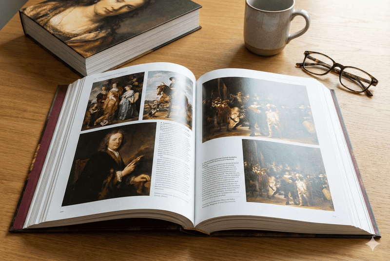

Struggling to match your printed art book colors to your screen? Mismatched colors can ruin your masterpiece and disappoint your audience. Master color management for perfect prints every time.
To master color management, you must calibrate all your devices, use the correct color spaces1 (RGB for digital, CMYK for print), and work closely with your printer. Soft proofing and creating specific ICC profiles2 are key steps to ensure the colors you see on screen are what you get in print.
I’ve seen countless artists and designers pour their hearts into a project, only to be let down by the final print. The vibrant reds on their screen turned into dull oranges, and the deep blues looked muted. This disappointment is completely avoidable. Understanding the fundamentals of color management is not just a technical step; it’s about protecting the integrity of your art. Let’s break down why this process is so critical and how you can take control of it to ensure your vision is perfectly translated onto the printed page.
Is color management important for accurate color reproduction in printing?
Ever wondered why your prints look completely different from your screen? This inconsistency can undermine the quality of your art book and your reputation. Proper color management is the simple solution.
Yes, color management is absolutely essential. It’s a standardized process that controls how colors are translated between devices, from your camera to your monitor to the final printer. Without it, you are leaving color accuracy entirely to chance, leading to unpredictable and often disappointing results.
I remember a project with a talented Print Production Director, Stephanie, who was creating a high-profile photography book. She spent months perfecting the images on her expensive monitor. But the first proofs came back from a different printer, and the skin tones were all wrong—they had a sickly, greenish cast. She was devastated. The problem wasn’t her photography; it was the lack of a color-managed workflow. Her monitor was showing her a beautiful, vibrant world that the press couldn’t replicate without proper instructions.
This is the core issue that color management solves. It acts as a universal translator for color. Think of it this way: every device speaks a different "color language." Your monitor speaks in light (RGB1), and a printing press speaks in ink (CMYK2). Color management, using standardized ICC profiles, provides the translation dictionary. It ensures that when your monitor says "bright crimson," the printer understands exactly which mix of Cyan, Magenta, Yellow, and Black ink to use on a specific paper to produce that same bright crimson.
| Feature | Unmanaged Workflow | Color-Managed Workflow |
|---|---|---|
| Consistency | Low. Colors vary wildly between devices. | High. Predictable and consistent color. |
| Accuracy | Poor. On-screen color rarely matches print. | Excellent. What you see is what you get (WYSIWYG). |
| Efficiency | Low. Requires many rounds of proofing and costly reprints. | High. Reduces guesswork and waste. |
| Outcome | Unpredictable, often disappointing results. | Professional, high-quality, and accurate prints. |
How can you ensure consistent color reproduction in print production?
Are you frustrated by color shifts from one print run to the next, or even within the same batch? This inconsistency devalues your work and your brand. Calibrating your devices is the key.
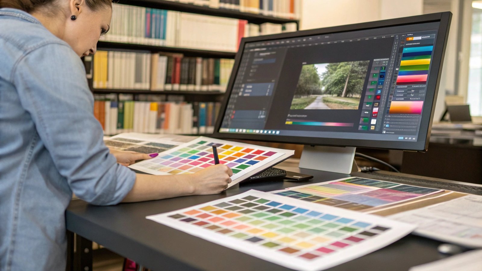
The foundation of consistent color is device calibration1 and profiling2. Use a hardware tool like a colorimeter to calibrate your monitor regularly. Then, work with your printer to use or create specific ICC profiles for their press and your chosen paper stock. This creates a predictable, repeatable workflow.
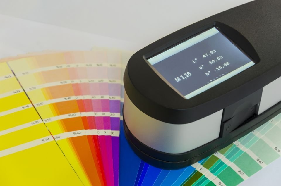
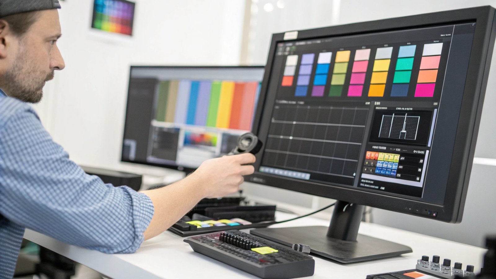
Consistency is the mark of a professional. To achieve it, you have to start at the source: your own screen. You simply cannot trust what you cannot measure. That’s why hardware calibration is non-negotiable for anyone serious about print. Software-only calibration is a good first guess, but a physical device like an X-Rite1 or Datacolor colorimeter is the industry standard. This little device hangs over your screen and measures the actual color and brightness being output. It then creates a custom "ICC profile" for your monitor, which tells your computer’s operating system how to correct the display to show standardized colors accurately. I recommend that my clients, like Stephanie, calibrate their main design monitors at least once a month, as monitor colors can drift over time. The process is simple: you plug in the device, run the software, and let it do its work in a few minutes. But it doesn’t stop at your monitor. The next critical step is communicating with your print provider. We at Huaxin Printing have specific ICC profiles for each of our printing presses and every type of paper we offer. When you provide us with files that have a standard working space profile embedded, our systems use our press profiles to make the perfect conversion. This ensures that the colors you approved on your calibrated screen are the colors we print on the page, every single time.
What steps should you follow to reproduce color accurately?
Are you unsure of the exact workflow for achieving accurate color in your art book? Skipping even one step can lead to costly and frustrating printing errors. Follow this simple, proven process.
First, calibrate your monitor. Second, design in a standard RGB color space like Adobe RGB (1998). Third, use your software’s "soft proofing" feature with the printer’s ICC profile to simulate the final print. Finally, always ask for a physical proof or test print before the full run.

Let’s walk through the exact steps that a professional like Stephanie now follows for every art book project. It’s a checklist that removes guesswork and guarantees accuracy from screen to print.
- Calibrate the Monitor: As we’ve established, she starts every project by calibrating her primary design monitor. This device becomes her ground truth for all color decisions.
- Set the Right Color Space: In her design software, like Adobe Photoshop or InDesign, she sets her working color space to a wide-gamut RGB space1 like Adobe RGB (1998). This captures far more color information than the default sRGB2, which is designed for web browsers.
- Use Soft Proofing: This is the most powerful and often overlooked step. Before sending us the final files, she uses the soft proofing function. We provide her with the specific ICC profile for our press and her chosen paper (e.g., "Huaxin_Coated_FOGRA51"). In Photoshop, she goes to
View > Proof Setup > Custom...and selects our profile. Her screen now simulates how the colors will look when printed on that specific paper. She might notice some very bright, vibrant colors become slightly less saturated. This is called a "gamut warning," and it shows her which colors are outside the printable CMYK range. She can then make targeted adjustments to bring those colors back into the printable range, maintaining full creative control. - Request a Hard Proof: Even with perfect soft proofing, nothing beats a physical copy. She always requests a contract proof from us. This is a high-quality, color-accurate print made on a special proofer that is calibrated to match our final printing press. She can hold it in her hands, view it under proper lighting, and give her final, confident approval before we print thousands of copies.
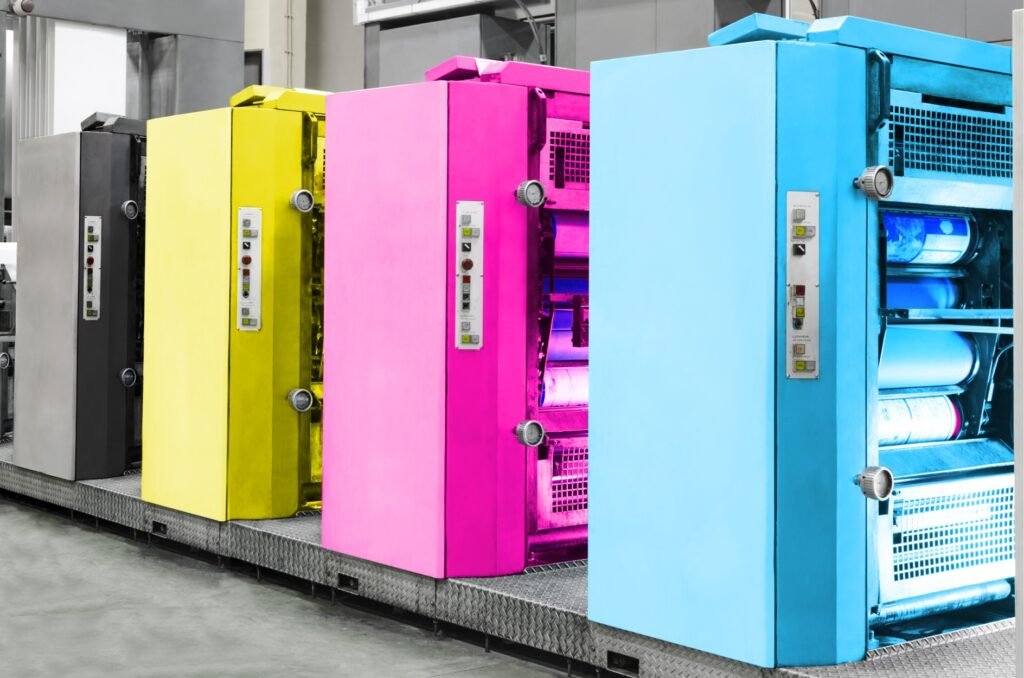
Which is more accurate, RGB or CMYK?
Are you confused about whether to design your art book in RGB or CMYK? Using the wrong one at the wrong time can dull your images and compromise the final quality.
Neither is "more accurate"; they are for different purposes. RGB (Red, Green, Blue) is for screens and has a wider color gamut. CMYK (Cyan, Magenta, Yellow, Black) is for printing. You should always work in RGB for as long as possible and let the print professional handle the conversion to CMYK.

This is a question I get almost every week from artists and designers. They often hear that they must convert their files to CMYK themselves before sending them to print, but this can actually be destructive to their colors. Here’s how I explain it to my clients: Think of the RGB color space as the huge, 120-piece box of crayons you had as a kid—it has every color imaginable, including neons and metallics. Now, think of CMYK as a smaller, specific 24-crayon set needed to draw a particular picture. You can’t replicate the neon green from the big box using only the crayons in the small box.
- RGB (Red, Green, Blue): This is an additive color model. It’s used by devices that create color with light, like your monitor, camera, and scanner. It starts with black (no light) and adds light to create colors. It has a very large gamut, or range of possible colors.
- CMYK (Cyan, Magenta, Yellow, Key/Black): This is a subtractive color model. It’s used in the physical process of printing, where ink is applied to paper. It starts with white (the paper) and subtracts brightness as ink is added. Its gamut is smaller than RGB’s, especially in the bright, vibrant greens, oranges, and blues.
The most accurate and professional workflow is to keep your images in their native RGB color space (like Adobe RGB 1998) for as long as possible during your editing process. This preserves the maximum amount of color information and creative potential. The conversion to CMYK should be the very last step, and it’s best handled by your printer. We use specialized software and our specific press profiles to make a much more intelligent conversion than the default one in Photoshop. This process, often called "late binding," ensures the best possible translation from your vibrant RGB image to the final printed CMYK page.
Conclusion
Mastering color management is crucial for protecting your art’s integrity. Calibrate your devices, use soft proofing, and communicate with your printer to ensure your final art book is perfect.