Skip to content

Ever wonder why your printed colors look different from your screen? This mismatch can ruin your design. Understanding the RGB and CMYK color modes is the simple, crucial solution.
RGB (Red, Green, Blue) is for digital screens. It creates color by adding light, making it vibrant. CMYK (Cyan, Magenta, Yellow, Black) is for printing. It works by subtracting light as ink absorbs it on paper. Use RGB for screens and CMYK for print.
Getting this right is fundamental in my 37 years in printing. A simple mistake here can throw off an entire print run. It’s not just about theory; it’s about practical results. Let’s break down exactly what these color models are and how they affect your work.
What are CMYK and RGB?
The terms CMYK and RGB are everywhere, but do you know what they really mean? Choosing the wrong one can lead to disappointing print results. Let’s clearly define them now.
RGB (Red, Green, Blue) is an additive color model. It starts with black and adds light to create colors, perfect for digital displays. CMYK (Cyan, Magenta, Yellow, Key/Black) is subtractive. It starts with white paper and subtracts brightness as ink is added.
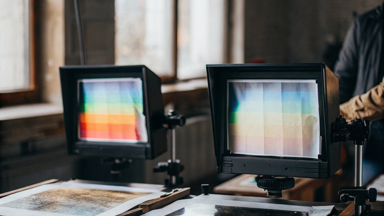
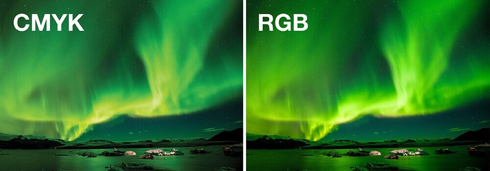
In my experience, the biggest hurdle for designers is thinking in terms of light versus ink. Your monitor emits light. This is why RGB works for digital. When you mix red, green, and blue light at full intensity, you get pure white light. It’s an additive process1. Printing is the opposite. We start with white paper, which reflects light. We then apply inks—Cyan, Magenta, Yellow, and Key (Black)—to absorb or subtract light. When you mix C, M, and Y, you get a muddy brown, which is why we add Black (K) for true, deep blacks. This is a subtractive process2. The range of colors a system can produce is called its "gamut3," and the RGB gamut is significantly larger than CMYK’s. This is why vibrant screen colors can look muted in print. Here’s a simple breakdown:
| Feature | RGB (Red, Green, Blue) | CMYK (Cyan, Magenta, Yellow, Key) |
|---|---|---|
| Usage | Digital Screens (Monitors, Phones) | Print (Books, Brochures, Posters) |
| Model | Additive (Adds Light) | Subtractive (Subtracts Light) |
| Colors | Wider, brighter range (gamut) | Smaller, more limited range |
| Black | Absence of light | Created with K (Key) ink |
| White | Combination of all colors | Absence of ink (the paper) |
How to tell if an image is CMYK or RGB?
You’ve received an image, but is it ready for print? Using the wrong color mode can cause production delays. Here’s how to quickly check the format in your design software.
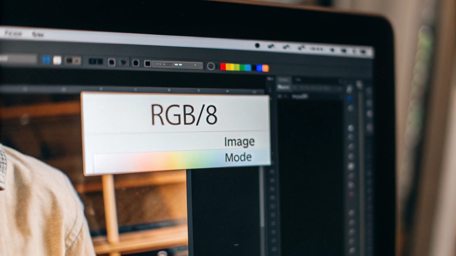
In most professional design software like Adobe Photoshop or Illustrator, you can easily check. Look at the document’s title tab—it often says (RGB/8) or (CMYK/8). Alternatively, go to the "Image" menu, select "Mode," and a checkmark will indicate the current color profile.
I remember a client years ago who was frustrated their book covers looked dull. The issue was simple: all their images were still in RGB. Checking this early saves so much trouble. Here’s how you can do it in the most common programs:
In Adobe Photoshop
Go to Image > Mode. You will see a checkmark next to the active color mode. This is also the menu where you can convert the color mode if needed.
In Adobe Illustrator
Look at the top of your document window. The file name will have either (CMYK/Preview) or (RGB/Preview) next to it. You can also check and change it under File > Document Color Mode.
In Adobe InDesign
InDesign is built for print, so it handles this well. You can check individual images by using the Window > Links panel. Select an image and look at the "Link Info" at the bottom of the panel. It will show the color space (e.g., RGB or CMYK).
Checking is a critical pre-flight step. It ensures what you send us is what you expect to get back.
What color format is best for printing?
Now you know the technical difference, but which format should you actually choose for print? Making the wrong choice is the single most common mistake I see. Let’s settle this definitively.
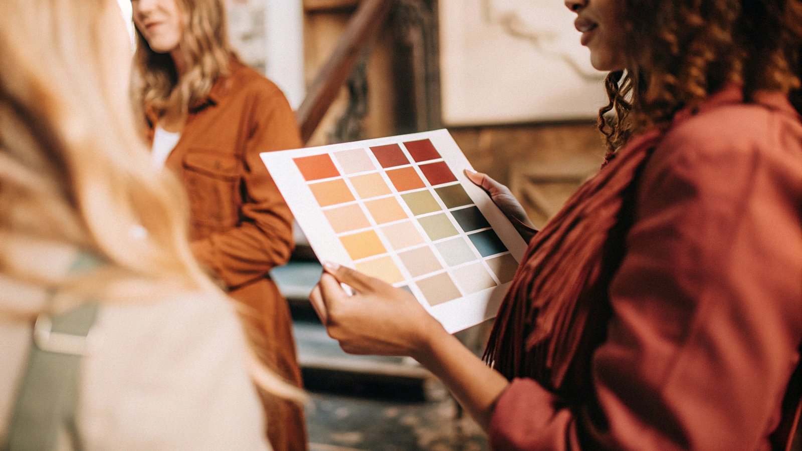
For any professional printing project—books, magazines, brochures—the answer is always CMYK. Printing presses use Cyan, Magenta, Yellow, and Black inks. By designing in CMYK, you are working in the native language of the printer, ensuring the most accurate color representation possible.
In my 37 years at the printing press, this has been a constant. Commercial printing is a physical process of applying ink to paper. Our machines are calibrated for CMYK inks1. When you design in CMYK, you’re essentially creating a direct recipe for those four inks. This gives you the most control over the final outcome. While CMYK is the standard for full-color images (what we call process color), there is another option for specific situations: spot colors2. Think of Coca-Cola red. For perfect brand consistency, a printer might use a pre-mixed Pantone ink3 instead of creating the red from CMYK dots. However, for photos and most designs, CMYK is the way to go. Your design file should be set up for the final output method.
Here’s a simple guide:
| Project Type | Recommended Color Format |
|---|---|
| Websites, Social Media, Apps | RGB |
| Professional Book Printing | CMYK |
| Brochures, Business Cards | CMYK |
| Branding with specific colors | CMYK + Spot Colors (e.g., Pantone) |
Do printers automatically convert RGB to CMYK?
Can you just send an RGB file and hope for the best? While some printers offer conversion, it’s a gamble with your colors. Let’s pull back the curtain on this process.
Yes, printers can and often do automatically convert RGB files to CMYK. However, this process is automated and not always predictable. You lose control over the final colors, and vibrant RGB shades can become dull or muddy. For best results, you should always convert the files yourself.
Think of it this way: the RGB color space1 is a big box of crayons, and the CMYK space2 is a smaller box. When you ask a printer’s software to convert your file, it has to find the closest match for every color that doesn’t exist in its smaller box. This is especially true for very bright, luminous colors like neon greens, electric blues, and hot pinks. These colors are created with light on a screen and simply cannot be recreated with ink on paper. The automated conversion algorithm will make a choice for you, and it’s often not the one you would have made. For example, a brilliant RGB blue often becomes a flatter, more purple-toned blue in print. By converting to CMYK yourself in Photoshop before finalizing the design, you can see this shift happen. This gives you the chance to adjust the colors and approve the result, maintaining full creative control.
Does CMYK look brighter when printed?
You might hope that a dull CMYK file will magically brighten up during printing. This misconception often leads to disappointment. Let’s set the record straight on what to expect.
No, CMYK does not look brighter when printed. Your screen is backlit, which always makes colors appear more luminous than they will on paper. The final printed brightness depends heavily on the paper choice. A glossy, coated paper will reflect more light and appear brighter than uncoated paper.
This is a crucial point that ties everything together. Your monitor is a light source; paper is a reflective surface. The printing process removes brightness by adding ink that absorbs light. Therefore, a printed piece can never be more luminous than your screen. However, you can control the perceived brightness significantly through your choice of paper.
Coated vs. Uncoated Paper
- Coated paper1 (gloss, silk, or matte) has a surface sealant that prevents ink from soaking in too deeply. The ink sits on top, resulting in sharp, crisp details and colors that appear more vibrant and bright.
- Uncoated paper2 is more porous. It absorbs more ink, which can cause the colors to look softer and a bit duller.
So, while the CMYK process itself doesn’t add brightness, pairing a correctly converted CMYK file with a high-quality coated paper will give you the most vivid result possible. Always ask your printer for a paper sample!
Conclusion
To ensure print quality, always design in CMYK. This gives you control, prevents unexpected color shifts, and matches your design to the language of the printing press for accurate results.
-
Explore the advantages of coated paper for vibrant prints and sharp details, enhancing your understanding of its applications. ↩ ↩ ↩ ↩
-
Learn how uncoated paper’s absorbency impacts color vibrancy and detail, crucial for choosing the right paper for your projects. ↩ ↩ ↩ ↩
-
Discover the significance of Pantone ink in achieving precise color matching for branding and design. ↩ ↩