
You designed it perfectly, but the printed color looks all wrong. This frustrating mismatch wastes time and money. Understanding the reason is the first step to fixing it.
The main reason is technology. Your monitor uses the RGB (Red, Green, Blue) light model to create colors. Printers use the CMYK (Cyan, Magenta, Yellow, Black) ink model. These two systems simply can’t produce the exact same range of colors, which causes the difference.

In my 37 years in the printing business, I’ve seen this happen countless times. A client is thrilled with their design on screen, but their face falls when they see the first physical proof. It’s a common challenge, but it is not an unsolvable one. The key is to understand that we are working in two completely different worlds: the world of light and the world of ink. To get a handle on this, we need to look closer at what makes them so different. Let’s explore why this happens and what you can do to get the results you expect.
What are the differences between print and screen colors?
Your screen shows vibrant blues and greens that your printer just can’t match. This difference, called gamut1, can change the entire feel and intent of your design.
Screen colors are made with light (RGB), an additive process where colors get brighter as you add more, creating white. Print colors use ink (CMYK), a subtractive process where colors get darker as you add more, absorbing light to create black.
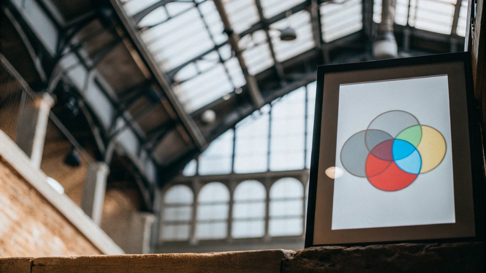
I often explain it to my clients like this. Imagine you are in a completely dark room. If you shine a red flashlight, a green one, and a blue one onto the same spot on a wall, the combined light becomes white. This is how your monitor works. It is an additive color system, starting from black and adding light to create colors.
Now, think about a white piece of paper. It starts bright. When you apply cyan ink, it absorbs the red light. Magenta ink absorbs the green light, and yellow ink absorbs the blue light. Each ink you add subtracts light from the white paper. This is a subtractive color system. The range of colors each system can produce is called a "gamut." The RGB gamut for screens is much larger than the CMYK gamut for print, especially when it comes to bright, glowing colors like neon green or electric blue. Your screen can create these colors with light, but there is no ink that can replicate that glow on paper.
Additive vs. Subtractive Color
| Feature | RGB (Screen) | CMYK (Print) |
|---|---|---|
| Model | Additive | Subtractive |
| Primary Colors | Red, Green, Blue | Cyan, Magenta, Yellow, Black |
| How it Works | Adds light to a black screen | Subtracts light from white paper with ink |
| Result of All Colors | White | Black (or a dark muddy brown) |
| Best For | Digital displays, websites, video | Printed materials, books, packaging |
Why do colors look different when printed?
You converted your files to CMYK, but the printed book is still off. This inconsistency can feel unpredictable and make you feel out of control of your project.
Beyond the basic RGB to CMYK conversion, physical materials are a huge factor. The type of paper, its brightness, and how it absorbs ink all change how the color looks. The specific printer and inks used also significantly affect the final output.
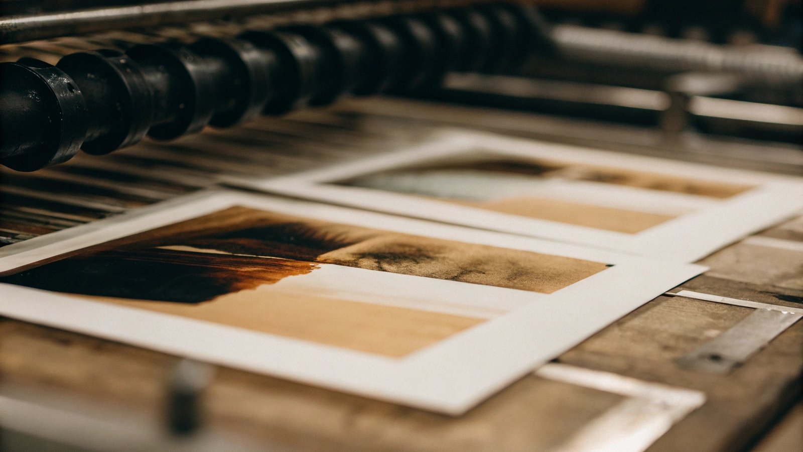
In my family’s printing business, we work with these physical variables every single day. A digital file is just a set of instructions; the final look depends on the materials we use. Paper choice is one of the biggest factors.
The Role of Physical Materials
- Paper Type: An uncoated, porous paper will soak up ink like a sponge. This can make colors appear darker and less saturated. On the other hand, a glossy, coated paper keeps the ink dots sitting on the surface. This makes colors look brighter, sharper, and more vibrant. The difference between the two can be dramatic.
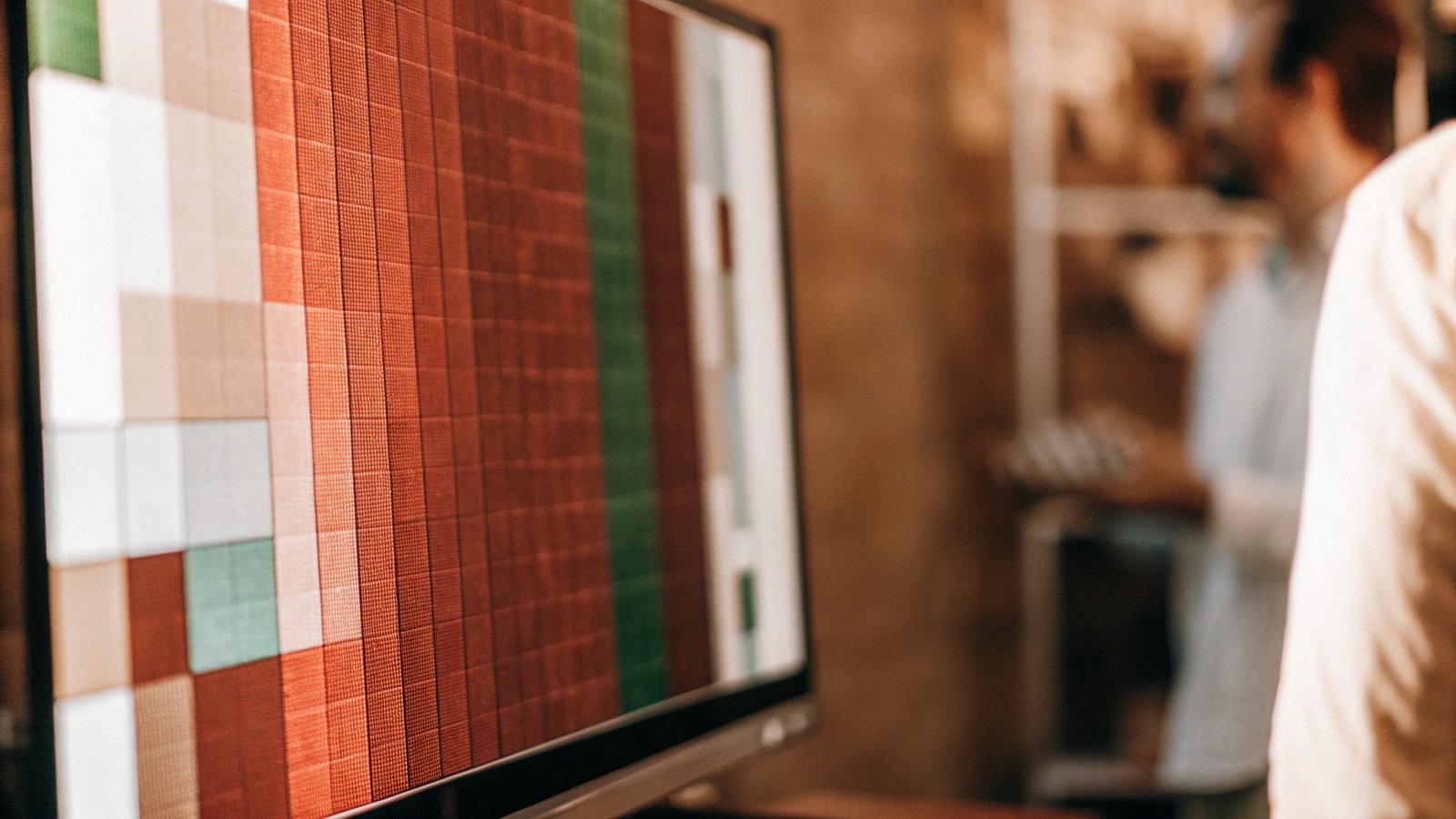
- Paper Color: Paper isn’t always pure white. It comes in many shades, from bright blue-white to creamy off-white. The starting color of the paper will directly influence how every ink color looks on top of it.
- Printer & Ink: Every printing press is a complex piece of machinery that needs constant calibration1 to produce consistent color. Even the specific batch of ink we use can have slight variations. It’s our job as printers to manage these factors to ensure your project looks the same from the first copy to the last.
Why do screens use RGB instead of CMYK?
If everything for print ends up in CMYK, why don’t design programs just use that from the start? It seems like this would solve the entire problem pretty easily.
Screens are light sources, so they simply cannot use the CMYK model. Monitors, phones, and TVs create images by directly emitting light from tiny red, green, and blue elements called pixels. This is the only way for a digital display to function.
This is a question that gets to the heart of the physics of color. A monitor screen is a grid of millions of tiny light bulbs. Each one of these pixels has three parts: a red one, a green one, and a blue one. By precisely controlling the brightness of each of these three little lights, the screen can mix them together to create millions of different colors for your eyes to see. It is an active light source, creating color out of darkness.
CMYK works in the opposite way. It is a passive, reflective model. Ink on paper doesn’t create its own light. It needs an external light source, like the sun or a lamp, to shine on it. The ink then absorbs certain wavelengths of that light and reflects the rest back to you. You can’t "print" with light, and you can’t make a screen "emit" ink. They are two fundamentally different technologies, each perfectly designed for its own medium—one for light-emitting displays and one for light-reflecting surfaces like paper.
How do you get accurate colors from your printer and monitor?
You’re tired of the guesswork involved in printing. Wasting your budget and time on reprints because the color is wrong is not a sustainable way to work.
The key is professional color management. This process involves calibrating your monitor, using the correct color profiles1 for your project, and communicating clearly with your printer. For critical projects, always ask for a physical proof to approve the color before the full print run.

As a printer, this is where we become a crucial partner in your project’s success. Stephanie, our Print Production Director with over 20 years of experience, always says that accurate color is a team effort. Here is the process we guide our clients through.
Step 1: Calibrate Your Monitor
What you see is not always what you get, especially if your monitor isn’t calibrated. A professional calibration tool is a small hardware device that measures the color from your screen and creates a profile to make it more accurate. This is the most important first step.
Step 2: Use the Right Color Profile
When you design, make sure you’re using the CMYK color mode meant for print. But don’t just pick any CMYK profile. Talk to your printer. We can tell you exactly which profile (like U.S. Web Coated (SWOP) v2 or FOGRA39) matches our presses and the paper you’ve chosen. This aligns your design file with our equipment.
Step 3: Request a Proof
For any project where color is important, a digital PDF proof is not enough. We always recommend a hard proof[2]. This is a sample printed on a specialized, calibrated machine that accurately simulates how the color will look on the final press. For the highest level of control, you can request a press check, where you visit our facility and approve the color in person as it comes off the actual press. This is the best way to guarantee you get the exact color you want.
Conclusion
The color difference between screen and print stems from their technologies, RGB and CMYK. With monitor calibration, correct profiles, and clear communication with your printer, this gap can be closed.