
Worried about a tiny proofing error ruining your entire print run? A single mistake can be costly. I’ll share my ultimate checklist to ensure your book is perfect.
To proof a book before printing, you must meticulously check both digital and physical proofs. This involves verifying file specifications, auditing the layout for errors like orphans, confirming color accuracy with a hard copy, and ensuring metadata like the ISBN is consistent across the book.
After 37 years in this business, I’ve seen it all. I’ve seen publishers lose thousands because they skipped one simple step. The difference between a successful book and a warehouse full of expensive mistakes often comes down to the proofing process. It’s more than just a quick look-over. It’s a systematic review that protects your investment and your reputation. So, let’s break down exactly what you need to look for, step-by-step.
What are proofs before printing?
Feeling lost in the jargon of "digital proofs" and "hard proofs"? Misunderstanding these terms can lead to expensive errors. Let’s clarify what each proof is for.
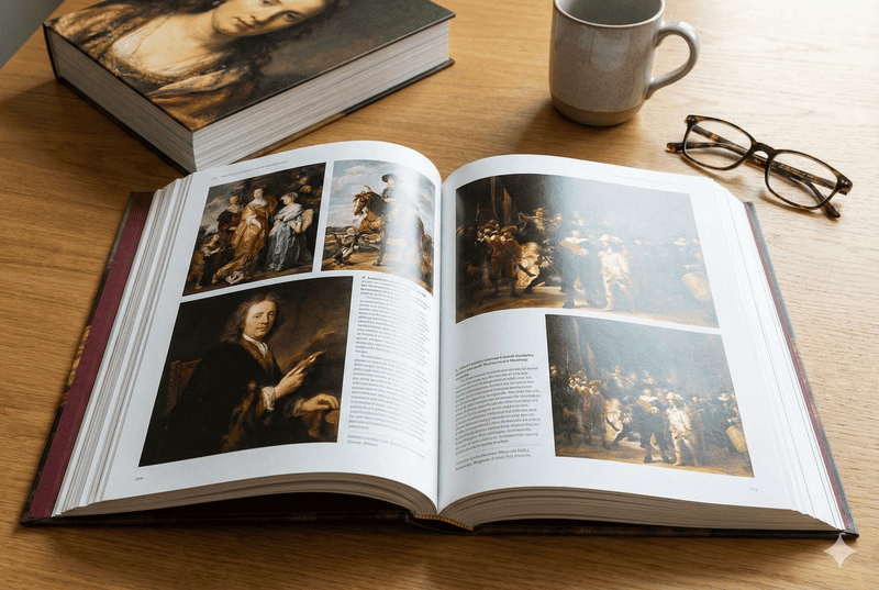
Proofs are pre-production copies of your book used for final review. They come in two main forms: digital proofs (PDFs) for checking layout and technical details, and physical proofs (hard copies) for verifying paper, binding, and true color accuracy before the full print run begins.

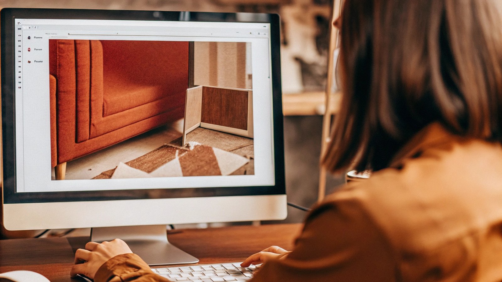
In my experience, the biggest mistakes happen when publishers treat all proofs the same. They are not. Each type has a specific job. A digital proof is your first line of defense. It’s a high-resolution PDF you get from your printer. Its main purpose is technical. You are checking that nothing shifted, no fonts got corrupted, and all images are present. A physical proof, on the other hand, is your only chance to feel the final product. I remember a client, a very experienced production director, who approved a book based only on the PDF. The colors on her screen looked perfect. When the 5,000 books arrived, the cover was a dull, muddy brown instead of the vibrant red she saw on her monitor. It was a costly lesson. A screen can never truly replicate how ink behaves on paper.
Digital vs. Physical Proofs
| Proof Type | Primary Purpose | What to Check | Limitations |
|---|---|---|---|
| Digital Proof (PDF) | Technical & Content Verification | Page order, text flow, image placement, typos, layout issues, trim marks. | Unreliable for color accuracy, cannot assess paper feel or weight. |
| Physical Proof (Hard Copy) | Material & Color Approval | Accurate color representation, paper stock, finish (gloss/matte), binding quality. | Can be more expensive and time-consuming to produce and ship. |
How to proof the paper and binding?
Your book’s design looks amazing, but will it feel right in your reader’s hands? The wrong paper or binding can ruin the experience. Let’s ensure your book feels premium.
To proof the paper, check its weight, texture, and opacity. Hold a page up to the light to see if text shows through. For binding, check the spine’s strength, ensure pages open smoothly without cracking, and verify the cover is aligned correctly with the book block.
When you get that physical proof, don’t just glance at it. You need to interact with it like a reader would. The tactile experience is a huge part of a book’s appeal. I always advise my clients to spend time just holding the proof. Does the cover laminate feel right? Does the paper weight feel substantial or flimsy? One time, a publisher of high-end art books specified a certain paper gsm but didn’t check the "bulk" of the paper. The final book felt much thinner and less impressive than they expected, even though the weight was technically correct. They learned that the physical feel is a combination of factors. You must check everything. Use a checklist to be systematic.
Physical Proof Checklist
| Component | What to Inspect | Key Questions to Ask |
|---|---|---|
| Paper Stock | Weight (GSM), opacity, texture, color/whiteness. | Does it feel right for the book’s price point? Can you see text from the other side? |
| Binding | Spine durability, page adhesion, cover alignment. | Do the pages turn easily? Does the spine crack when opened wide? Is the cover centered? |
| Cover Finish | Laminate (gloss/matte), special finishes (foil, emboss). | Is the finish applied evenly? Are special effects aligned correctly with the artwork? |
How to proof files before printing?
Your layout looks perfect on your screen, but are the files technically sound for printing? Hidden file errors can lead to a blurry, unprofessional final product. Let’s find them.
Proof your files by checking the digital PDF from your printer. Verify all images are high-resolution (300dpi minimum), colors are in the correct mode (CMYK), and all fonts are embedded. Also, check for layout issues like ‘widows’ and ‘orphans’ and ensure page numbering is correct.
The digital proofing stage is where you become a detective. It goes far beyond a simple spell check. I always tell my clients, like Stephanie, that this is the final gatekeeper for layout integrity. A professional proofread at this stage is a typographical audit. I once worked on a cookbook where all the page number cross-references in the index were off by two pages because of a last-minute chapter addition. The client only caught it because they meticulously checked ten random entries. This kind of detailed check is vital. You must also verify the technical details that your design software might not flag.
Typographical and Layout Audit
Your final check should hunt for ‘widows’ (a single word at the top of a new page) and ‘orphans’ (a single line at the bottom of a paragraph). These make the text look unprofessional. Check that headers and footers are consistent on every page. Make sure page numbers are correct and correspond to your table of contents.
Metadata Integrity Check
This is critical and so often missed. Find the ISBN1 on your copyright page2. Now, find the barcode on your back cover. The number printed below that barcode MUST be the exact same ISBN. A mismatch here will cause chaos with distributors and online retailers, making your book unscannable and unsellable. It’s a small detail with huge consequences.
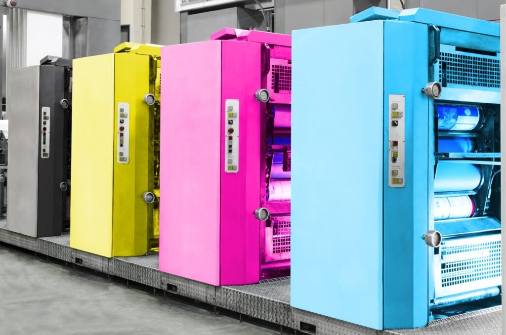
How to proof colors before printing?
The vibrant red on your monitor might print as a dull brown. Relying on your screen for color accuracy is a gamble. Let’s talk about how to get it right.
The only reliable way to proof colors is with a physical, hard-copy proof from your printer. Compare this printed proof to your original design files under neutral lighting. Pay close attention to brand colors, skin tones in photos, and the overall color cast of the book.
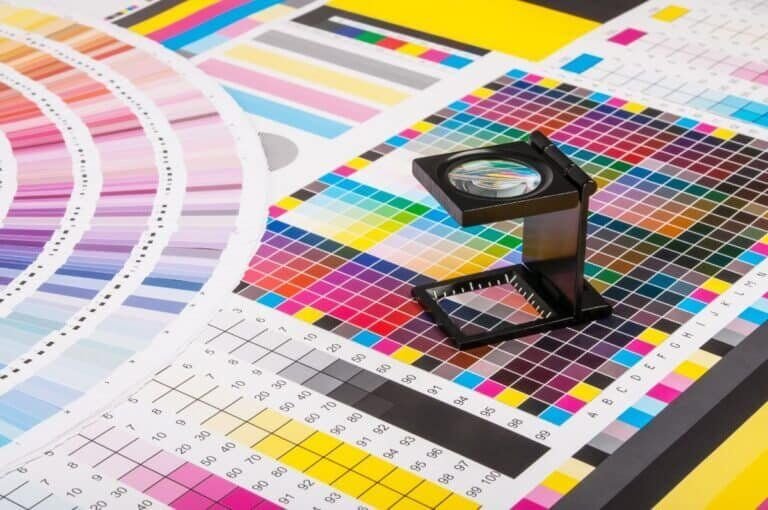
I cannot stress this enough: your computer screen lies to you about color. Screens create color by mixing Red, Green, and Blue light (RGB). Printing presses create color by mixing Cyan, Magenta, Yellow, and Black ink (CMYK). They are fundamentally different systems. What looks bright and vibrant on a backlit screen can look flat and dark when printed with ink on paper. This is why a physical proof, sometimes called a "contract proof," is non-negotiable for any project where color is important. When you receive that proof, don’t just glance at it in your office. Take it to a window with natural daylight.
Key Color Areas to Scrutinize
| Color Area | What to Look For | Pro Tip |
|---|---|---|
| Cover Art | Brand colors, key visuals, title text color. | Is the main color accurate? Does it pop or look muted? |
| Interior Photos | Skin tones, landscapes, product shots. | Do people look natural, not too red or green? Are details visible in dark areas? |
| Overall Tone | Consistency throughout the book. | Is there an unwanted color cast (e.g., everything looks slightly yellow)? |
If you have a specific brand color, you should be printing with a Pantone (spot) color for perfect consistency. But for most photos, a well-managed CMYK workflow and a hard proof are your best tools.
Conclusion
A thorough proofing process, checking both digital files and physical copies, is your best insurance. It protects your investment and ensures the final book matches your vision perfectly.