")
Want a luxurious book cover but feel lost with the technical details of foil stamping? File errors can cause costly reprints and delays, ruining an otherwise beautiful design.
To prepare foil stamping files, create a separate vector layer1 using 100% solid black for all foiled elements. You should avoid very fine lines, complex details, and placing foil over score lines. This process ensures a clean, crisp, and luxurious finish on your book cover.

Getting that stunning foil finish is a game-changer for any book. But the magic really happens long before the press starts running. It all begins with a well-prepared file. Let’s walk through the process step-by-step. This will help you feel confident when you hand your design over for production. It is simpler than you might think once you know the key rules.
Have you ever seen those shiny, metallic book covers and wondered how they are made? The process can seem complicated, but it’s actually a straightforward technique that adds incredible value.
Foil stamping is a printing process where a heated die presses metallic or pigmented foil onto a surface like paper. This creates a crisp, slightly indented, and luxurious finish. It adds significant visual and tactile appeal to book covers and other printed items.
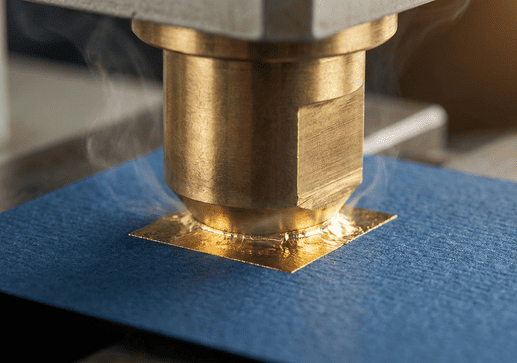
I remember when my grandfather first showed me the foil stamping machine in our family’s print shop. The mix of heat, pressure, and that shimmering roll of foil seemed like magic. He told me, "Frank, this isn’t just ink on paper. This is giving the book a piece of jewelry to wear." That idea has always stuck with me. Foil stamping is about creating a first impression that feels special and valuable.
The process creates a unique tactile experience. It engages the sense of touch in a way that standard ink printing cannot. The heated die presses the foil into the paper, creating a subtle debossed effect you can feel with your fingertips. This durability also makes it a great choice for titles and author names, as it resists scuffing better than ink. Beyond classic gold and silver, foils come in many finishes.
| Foil Type | Description | Best For |
|---|---|---|
| Metallic | Shiny, reflective finish like gold, silver, copper. | Classic, luxurious titles and logos. |
| Matte Pigment | Solid, non-reflective color. | Modern, subtle, and sophisticated designs. |
| Gloss Pigment | Solid, shiny color without a metallic look. | Bold, eye-catching color accents. |
| Holographic | Reflects a rainbow of colors that shift with light. | Sci-fi, fantasy, or attention-grabbing covers. |
How do you prepare a file for foil printing?
You are ready to add beautiful foil to your book cover design. But one small error in your file setup could jeopardize the entire print run, leading to disappointment.
To prepare your file, create a separate, clearly labeled layer for the foil design. All elements on this "foil mask" layer must be 100% solid black and in vector format. This file tells the printer exactly where to apply the foil.
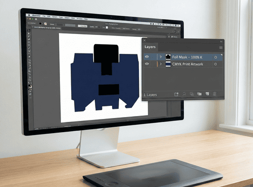
The key to perfect foil stamping is creating a proper "foil mask" file. This is a separate file or layer that contains only the elements you want to be foiled. Think of it as a stencil for the foiling machine. Here is a simple, step-by-step guide for creating one in a program like Adobe Illustrator:
- Create a New Layer: In your final cover design file, create a new layer. Name it something clear, like "Foil Mask" or "Foil Layer."
- Copy and Paste: Select the elements you want to foil from your main artwork. Copy them. Then, paste them in the exact same position on your new "Foil Mask" layer. Perfect alignment is critical.
- Use 100% Black: Change the color of all elements on the foil layer to 100% K (black). Do not use any other color, gray, or a mix of CMYK. The solid black area represents the physical shape of the die that we will create.
- Save Separately: Save your main CMYK artwork and your foil mask as separate files. Or, provide a layered PDF with the layers clearly labeled.
At Huaxin Printing, we often get files where the foil layer is colored gold or silver to show how it should look. I appreciate the effort, but it is not necessary. Always use 100% black for the mask. It is the universal industry standard and ensures we create the die perfectly.
Why is it better to use vector files for cover foil stamping?
You have a great design for your cover, but is it in the right file format? Using the wrong type, like a JPEG or other raster image, can result in blurry, pixelated foiling.
Vector files are essential for foil stamping because they are made of mathematical paths, not pixels. This allows them to be scaled to any size without losing quality. It ensures the metal die is created with perfectly sharp and clean edges for a crisp impression.
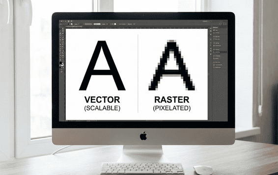
Think of it this way: a vector file is like a recipe. You can use it to bake a small cookie or a giant cake, and both will be perfect. A raster file1 (like a JPEG or PNG) is like a photo of a cake.
The foil stamping process starts with creating a physical metal die. We use your digital file to guide a machine that carves this die. If we use a vector file, with its clean lines and curves, the die will have perfectly sharp edges. This precision is then transferred to your book cover, resulting in a crisp, clear foiled image. If we were to use a pixelated raster image, the die itself would have rough, jagged edges, and the final foil would look messy and unprofessional.
This is also why gradients, tints, or photographic images cannot be used for foiling. The die is a solid piece of metal. It is either "on" (pressing the foil) or "off" (not pressing). There is no in-between, so you cannot create a 50% tint or a smooth color transition with a solid die.
What are the most common mistakes when making foiling files?
You have followed the basic steps to create your foil file. But small, overlooked mistakes can still cause big production headaches and lead to imperfect results on the final product.
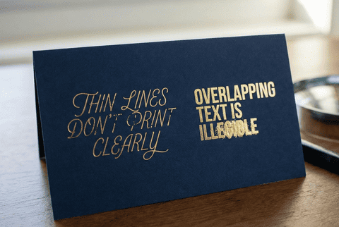
The most common mistakes are designing lines that are too thin, placing elements too close together, using raster images, and applying foil over score lines where the cover folds. These issues can cause the foil to bleed, flake, or not transfer cleanly.
After 38 years in this business, my team and I have seen it all. To help you get a flawless result, here are the most frequent issues we encounter with foil files and how to avoid them.
- Lines Are Too Thin or Gaps Are Too Small: This is the number one problem. Hot foil can spread slightly under pressure. If your lines or the spaces between them are too fine, the foil will bleed together and turn your intricate design into a smudge. As a rule of thumb, make sure all lines and spaces are at least 1 point thick.
- Foil Over a Score Line: A book cover needs to fold at the spine and hinges. Foil is a thin, non-flexible layer of material. If you place it over a score line1 where the paper will be creased and folded, the foil will crack and flake off. Always keep your foil elements at least 1/8 inch (about 3mm) away from any fold lines.
- Using Complex Textures or Distressed Effects: While a distressed look can be trendy, it is very difficult to replicate with foil stamping. Tiny, disconnected specks of foil may not adhere well to the paper. It is better to use solid, continuous shapes for the best results.
- Misaligned Files: Make sure your foil mask layer lines up perfectly with your main print artwork. Any misalignment will be obvious on the final cover, with the foil appearing shifted from the underlying design.
What should you consider about the paper when foil stamping a book cover?
You have created the perfect design and a flawless foil file. But applying that design to the wrong paper stock can lead to poor adhesion or an underwhelming final effect.
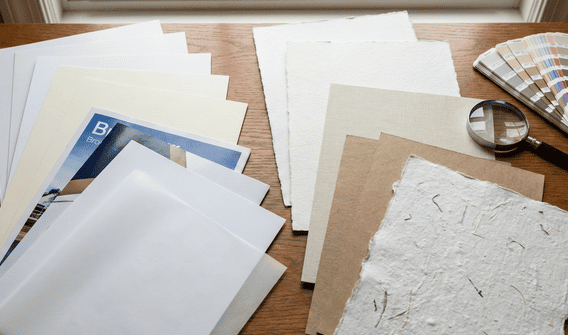
When choosing paper for foil stamping, smoother surfaces work best. Coated and matte-laminated stocks are ideal because they provide a clean, even base for the foil to adhere to. Highly textured papers can be challenging, as the foil may not apply evenly.
The interaction between the foil and the paper surface, or substrate, is crucial. When my team consults with a print production director like Stephanie, the first thing we discuss is the paper she wants to use.
Smooth surfaces are a foil’s best friend. A paper with a coating or, even better, a matte or gloss laminate provides a perfectly even, non-porous base. The foil can adhere cleanly across the entire design, resulting in a crisp and solid finish.
Textured or uncoated papers are a different story. The foil may not be able to settle into the small "valleys" of the paper’s texture. This can create a broken or rustic look. Sometimes this is exactly the effect a designer wants, but it is an important outcome to be aware of. If you plan to use a heavily textured stock, it is always a good idea to run a test first. For very fine details on a textured stock, we might suggest debossing the area first to create a flat surface, then applying the foil.
You can also combine foil with other techniques. An "embossed foil" design is raised up, creating a dramatic 3D effect. The standard stamping process already creates a slight deboss, but we can exaggerate this for a more indented feel. These combinations create a truly sophisticated cover that engages both sight and touch.
Conclusion
Foil stamping creates a stunning, premium effect. By using clean vector files, avoiding common technical mistakes like thin lines, and choosing the right paper, you can guarantee a luxurious finish for your book.