If you’re in the business world, you know that keeping track of time is crucial. A wall calendar is not just a piece of paper; it’s a time management tool, a promotional strategy, and sometimes even a work of art. And that’s why even though there are cell phones, smart watches and even AI speakers telling you the date, wall calendars are still hanging on the walls in the offices and at homes.
So, how are those beautifully designed wall calendars manufactured?
Well, the answer lies in the meticulous process that begins with design, involves multiple rounds of quality checks, and ends with a tangible, functional, and aesthetic product. Let’s delve deeper to see what it takes to bring a wall calendar to life.
Intrigued? You should be. At Huaxin Printing, we’ve been mastering this art for 35 years, and today we’ll give you a behind-the-scenes look at how it’s done.
No. 1 How Crucial Is Design in Wall Calendar Manufacturing?
When it comes to wall calendar design and manufacturing, it’s not just about aesthetics. In fact, technical components play a vital role in shaping the final product. As a seasoned printer, I can’t emphasize enough how much the details matter. Let’s dive deep into these critical elements that can make your wall calendar a true masterpiece.
Say Yes to High-Resolution Images: 300 DPI is a Must
Don’t underestimate the power of a high-resolution image. A sharp, detailed photo will not only make your calendar pop but also enhance your brand’s reputation. Aim for nothing less than 300 DPI (dots per inch). Studies show that top-quality images resonate with consumers, ensuring your product stands out in a crowded market.
The Essential 3mm Bleeding Line: Don’t Skip It
The 3mm bleeding line might seem like a trivial detail, but skipping it can lead to major print disasters. This tiny margin safeguards your design, ensuring that critical elements won’t get cut off during the final trim. Trust me, you’ll want to have this buffer; it ensures a polished, professional look.

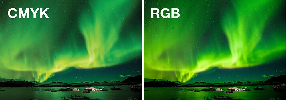
Color Consistency: RGB to CMYK Conversion
Ever noticed how colors can appear differently on screen compared to when they’re printed? That’s because most digital devices use the RGB color model, while printers operate in CMYK. A proactive RGB to CMYK conversion ensures color accuracy, meaning what you design is what you’ll get in print. I’ve seen too many great designs ruined by color mismatches, and this simple step can save you from that fate.
Drill Hole Positioning: Plan to Prevent Design Disruption
Last but not least, consider the drill hole. To make the calendars properly hanged on the wall, usually there’s a hole drilled on each page of the calendar, including the front and back cover. This small functional feature can wreak havoc on a design if not properly planned for. Always make sure that key design elements, like text or logos, aren’t in the drilling zone. It’s not just about the hole; it’s about a seamless integration of form and function.

No.2 What About the Types of Paper Used?
Ah, the subtle art of choosing the right paper for your wall calendar. It may not be the first thing you think about, but let me assure you, it’s a game-changer. The type of paper you opt for can greatly affect the print quality, durability, and even usability of your calendar. Let’s talk about this often overlooked, but crucial, element in calendar printing.
Text Pages: The Go-To for Vibrant Images
If your calendar is going to feature some color-rich images, you can’t go wrong with coated paper. This could be glossy art paper, which makes the colors really pop and adds a luxurious sheen, or matte art paper, which offers a more subdued but equally captivating look. Either way, the coating allows for high ink absorption, ensuring your images are as vibrant on paper as they were on your screen. Trust me, if you want your visuals to make a statement, coated paper is your friend.

Cover Pages: Because First Impressions Matter
Moving on to the cover page, that’s your calendar’s handshake, the first interaction with the consumer. To make it impactful, I’d recommend using art card paper. This heavyweight paper exudes quality and durability, offering a premium feel right off the bat. It’s also incredibly versatile, allowing for additional finishes like embossing or foil stamping. Remember, the cover sets the tone for the rest of the calendar; make it count.
Uncoated Woodfree Paper: The Writeable Option
Now, if you’re crafting a calendar meant for writing, say, a planner-style calendar, uncoated woodfree paper can be a suitable choice. The absence of coating makes it easy to write on. However, keep in mind that this type of paper absorbs more ink, which can result in less sharp colors. If vibrant imagery isn’t your main goal and you want to offer a tactile, writeable surface, this could be the paper for you.
FSC Paper: Go Green Without Compromising Quality
If sustainability is a priority for your brand, consider using FSC (Forest Stewardship Council) certified paper. This ensures that the paper comes from responsibly managed forests, helping you kcontribute to a more eco-friendly product without sacrificing print quality.

No. 3 How Does Color Management Work?
Now we come to color—the soul of any print product. Get it right, and you have a masterpiece; get it wrong, and well, let’s not go there. You’ve already heard my spiel on the importance of converting to CMYK. That’s your starting point. But what comes next? Let’s navigate through the labyrinth of color management in printing.

A Nod to CMYK: Our Trusty Base
I won’t go on about this since we’ve covered it earlier. Just remember, always start with CMYK conversion. It sets the stage for color accuracy throughout the printing process.
ICC Profile: The Harmonizer
The ICC profile is like your color map, guiding how colors will appear on the chosen paper type. Make sure it’s consistent with the paper you’ve selected. For example, coated paper would usually go with the FOGRA 51 and uncoated paper goes with FOGRA 52. And of course, if you want some extra amazement with the color, you could also consider Pantone or wide-gamut colors.
This color-profile consistency avoids unwanted color shifts and ensures your design comes out just how you envisioned it. It’s like having GPS for your colors, making sure they arrive at the right destination. You may click here for more detailed information about color profiles and calibrations.
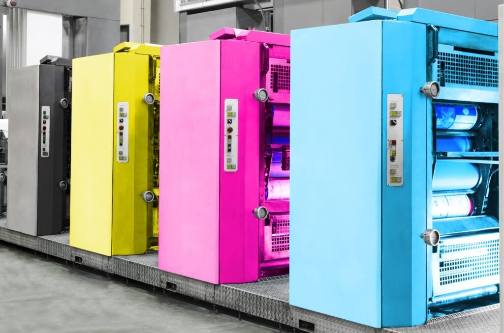
Epson, Digital, and Offset: The Triplets of Color Proofing
When it comes to proofing, be aware that what you see isn’t always what you get. Epson proofing, digital printing, and offset printing each have their own characteristics. An Epson proof provides a close approximation but isn’t the final word. Digital printing is great for short runs, but colors may vary slightly. Offset is the gold standard, especially for large volumes, but requires careful calibration.
Be aware that there’s a likelihood that the colors on the actual printing sheets may be a bit different color proofs (be it Epson proofing or digital printing copies) that you earlier approved. This does not necessarily mean that your printer is doing a poor job. Because of the different ink and paper types, as well as processes of printing, color variance is sometimes inevitable between proofs and actual printed sheets. This is especially true if you are using uncoated woodfree paper for your calendar. By international standard, approx. 85% approximation would be considered acceptable.

Talk to Your Printer: The Color Management Toolkit
Don’t shy away from discussing color management systems with your printer. Look, it’s easy to slap some ink on paper, but achieving true color accuracy is an art and a science. Ask about standards and tools like ISO 12647-7, G7, CIP-3, and X-Rite calibrate readers. These are not just fancy terms; they’re essential for ensuring color consistency from screen to print.
Color management is like cooking a gourmet meal. You need the right ingredients, the right techniques, and yes, a bit of magic to make everything come together. So go on, indulge in the world of color. Your calendar (and your customers) will thank you.
No. 4 What are the post-printing steps?
We’ve navigated the complexities of paper choices and color management, and now it’s time for the next important lap: post-printing. This is where the magic really happens, transforming your calendar from a printed sheet to a finished masterpiece.
Saddle Stitching: The Classic Choice
The binding of your calendar can make or break its usability. One of the most common methods we employ here is saddle stitching. It’s durable, cost-effective, and ideal for wall calendars that are not too thick. It’s the “jeans and a white tee” of binding—simple, yet stylish.

Page Layout: Keeping Main Characters in the Spotlight
Speaking of style, let’s talk layout. Imagine the horror of seeing a main character in your beautiful art piece getting folded over to another page. Tragic! Always pay attention to how your images will appear post-binding. The integrity of your artwork should stay intact, from the first glance to the last day of the year.
The Grand Finale: Lamination and Varnishing
You didn’t think we’d end without some finishing touches, did you? Lamination adds a protective layer to your calendar, making it more resistant to wear and tear. Varnishing takes it to another level, adding a touch of gloss or matte finish for that extra oomph. It’s like putting on a pair of dazzling earrings to complete an already fabulous outfit.

The post-printing process is where your calendar truly comes to life. From the binding to the finishing, each step is crucial in delivering a product that is not just functional, but also a work of art. Cheers to creating calendars that are, quite literally, a sight for sore eyes.
No. 5 Packaging Your Wall Calendar: The Final Frontier Before Touchdown
Now we come to the last leg of the journey. Picture this: you’ve crafted the perfect calendar, filled with glorious images and top-notch printing. Now it’s time to wrap up that beauty so it reaches your customer in pristine condition. Let’s break down how we at Huaxin Printing ensure that your calendar doesn’t just travel—it travels in style.
The Unsung Hero: The Stiffener Board
Don’t underestimate the power of a good stiffener board. Think of it as the backbone of your calendar package, providing the structural integrity your calendar needs to stay in mint condition. Just as a picture frame enhances the beauty of a painting, a stiffener board adds that extra layer of security.

Dehydration: Not Just for Fruits!
Printing in a high-humidity environment? We’ve got you. A dehydration process might be just what you need to prevent warping. Nobody wants a calendar that’s bent out of shape. Dehydration ensures that your calendar doesn’t just survive but thrives, whatever the climate.
Shrinkwrapping: The Final Embrace
Imagine receiving a gift with scratched-up wrapping paper. Kills the mood, doesn’t it? The same goes for shrinkwrapping. It needs to be flawless. A perfect shrinkwrap seals in the grandeur of your calendar, making sure it reaches your customers just as you intended: impeccable.
Abrasion and Temperature Tests: The Overseas Gauntlet
Ah, the challenges of shipping overseas. If your calendars are crossing oceans, you need packaging that can withstand the seven seas—or at least some bumps and temperature swings. Make sure your carton has been through abrasion and high/low-temperature tests. It’s like sending your calendar to boot camp before it goes off on its big adventure.
So there you have it—our final touches that ensure your calendar doesn’t just look good, but arrives good. At Huaxin Printing, we believe that packaging isn’t just an afterthought; it’s the final chapter in a well-told story. Here’s to sending your calendar off into the world, wrapped in excellence!
No. 6 How Important Is Quality Inspection?
Picture this: The printing is done, and your calendars are looking as dapper as a groom on his wedding day. But wait, before they walk down the aisle to meet your customers, there’s one final checkpoint: Quality Inspection. This is the moment of truth, my friends, where we at Huaxin Printing play the guardian angel role for your calendar’s perfection.
Content and Page Order: A Well-Edited Symphony
We’ve all faced the horror of a misprint or two in our lifetime, haven’t we? In the quality inspection phase, the content and order of each page are scrutinized as if it’s a manuscript for a Pulitzer Prize. No stone (or page, in this case) is left unturned.
The Color Quest: True to Proof
Colors can be as tricky as a cat on a hot tin roof. Your calendar’s shades should match the color proof, and we’re keenly aware that what you see in the Epson or digital printing proof may not perfectly translate in offset printing. Lamination and varnishing can also play tricks on color, particularly on that cover page that needs to be the showstopper.
The Binding Oath: No Page Left Behind
Your calendar could have the most eye-popping visuals and life-changing content, but if the binding is weak, it’s all for naught. During inspection, we ensure each page is bound as securely as a pirate’s treasure chest. No page shall fall!
The Final Frontier: Stiffener and Shrink Wrapping
Last but not least, we examine the stiffener board and shrink wrapping. Your stiffener should be as firm as a handshake at a business meeting, and the shrink wrapping should be as flat and pristine as a glassy lake at dawn.
Quality inspection is where the rubber meets the road. It’s our final assurance that what leaves our facility is nothing short of top-notch. Because at the end of the day, perfection isn’t just a goal; it’s a promise. Cheers to quality that speaks volumes!
Conclusion
Creating a wall calendar is an intricate process involving multiple steps and considerations. From design to paper type, color management to printing techniques, quality assurance to post-press operations, every step is critical in delivering a product that not only looks good but also performs well. At Huaxin Printing, we’ve got it down to a science.
That’s it. Now you have a bird’s eye view of what it takes to manufacture a top-quality wall calendar. For any queries, feel free to reach out; we’d love to hear from you.